
One strategy. Executed with machine discipline and a copilot that speaks.
ORBIT is a desktop trading platform built around the Opening Range Breakout — live futures charts on professional-grade market data, an engine that trades the plan inside hard risk rails, and a voice-native AI copilot that watches the tape with you, answers out loud, and grades your discipline.
ORB, executed by the book
The opening range, the break, the retest — detected live and traded automatically or on your confirmation. Daily loss limits, trade caps and per-session budgets are hard rails the engine cannot cross.
Say… “Hey ORBIT”
A voice-native AI that sees your chart. Ask what is happening, where your stop is and why, whether the setup fired — and hear the answer while your eyes stay on the tape. She calls your fills out loud, too.
Professional-grade market data
Real-time CME futures over professional market-data infrastructure, months of tick-true history, and volume profile built from real order flow. Bring your own broker and data entitlements — your credentials never leave your machine.
ORBIT SCORE & journal
Every trade lands in a journal that computes profit factor, drawdown, win/loss quality and a single 0–100 score of how well you followed the process — with a progress tracker for the rules you set.
Paper accounts & fire drills
Up to 18 charts on one screen, each bound to its own account — paper or live — with linked charts sharing wallets and settings at the click of an LED. Simulated fills with slippage and commissions, drill buttons that prove the pipeline end to end, and a system check that tests every link before you arm anything real.
A platform that learns from you
Mark the setups you believe in and send them — with full chart context — into ORBIT’s training memory. Your labeled tape becomes the ground truth for what the platform learns next.
Four systems. One engine. Nothing to keep in sync.
ORBIT is four systems that each do one job properly — the trading platform, BOT LAB, HEATMAP and the BRAIN ENGINE. What makes that worth having is that they are not four applications. They are four views onto one engine, one market-data connection, one set of books and one brain.
Anyone who has run a chart package beside a strategy tester beside a depth tool knows the tax: three logins, three data subscriptions, three ideas of what your position is, and a reconciliation problem every evening. Here there is nothing to reconcile, because nothing was ever separate.
 CLICK TO ENLARGE

Where you trade.
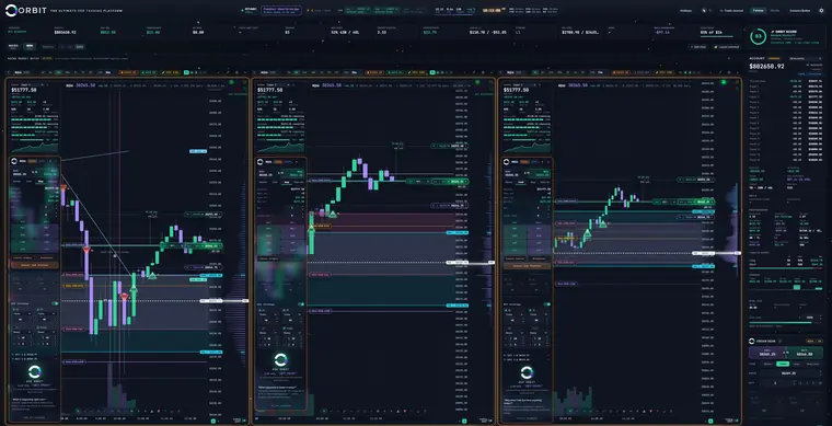
Up to eighteen live charts, and every one of them is a complete trading desk rather than a picture of a market. Its own order ticket, its own account, its own risk rails, its own bot — so the chart you are looking at is the chart you are trading, and there is never a question of which account a click is about to reach.
The opening range is drawn where it happened. The volume profile is built from real prints down the right edge. And the whole thing is glass, so the market keeps moving underneath whatever panel you just opened.
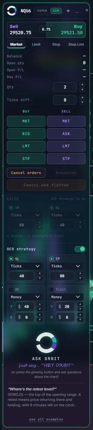
- Order desk docked to its chart — market, limit, stop and stop-limit, with OCO brackets, breakeven and trail, all set before you send rather than chased afterwards.
- Risk rails on screen: daily loss, drawdown and target, each showing how much room is left before it stops you trading.
- ASK ORBIT sees your whole screen, points and draws on it while she explains, and knows the P&L of the book behind any chart you ask about.
- Paper by default. Live when you decide. Every bot is born disarmed and on paper. Any one of them can be switched to trade live for you, chart by chart, whenever you are ready — and a live route needs the broker connected and the live gate deliberately opened, so it is never something that happens to you by accident.
 CLICK TO ENLARGE

Where strategies argue it out.
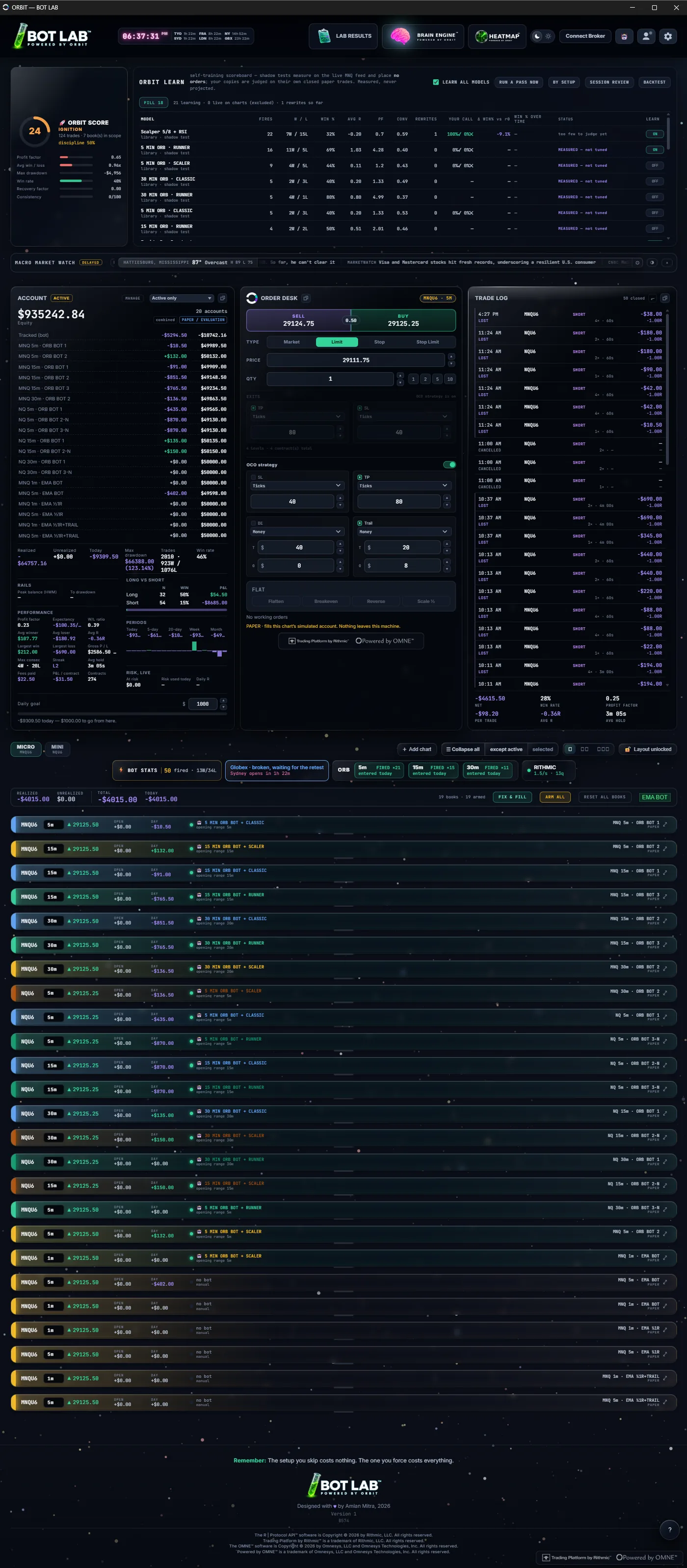
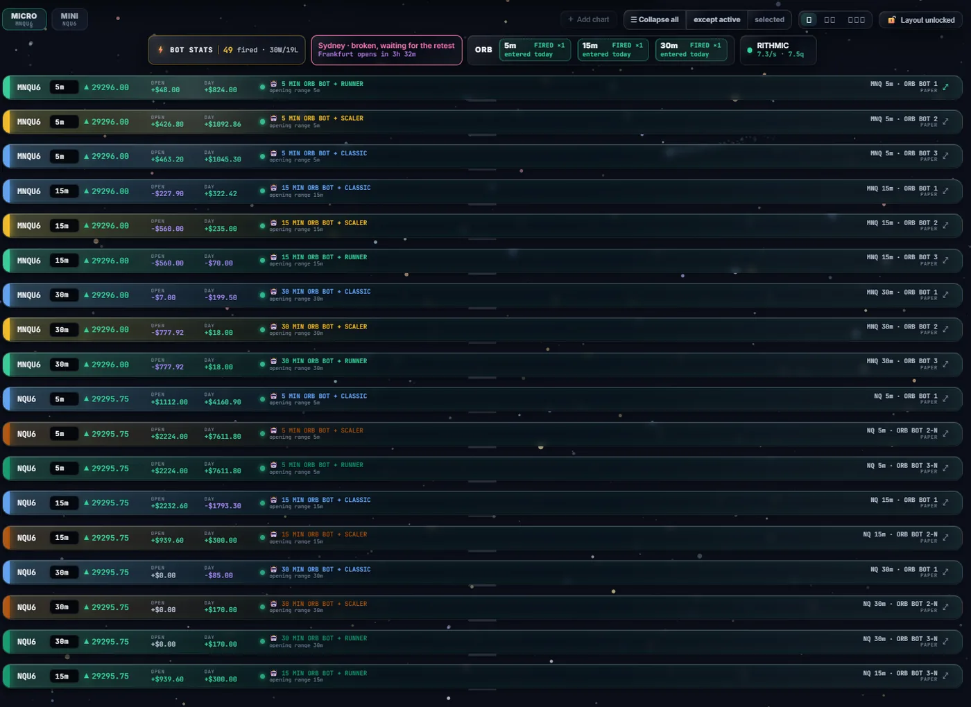
Every trader has the same argument with themselves: is this setup actually working, or do I just remember the times it did? The BOT LAB settles it by running the variations side by side, in the live market, on separate paper accounts — so at the end of a session there is a table instead of a feeling.
Twenty-five of them at once. Same instrument, same second, different settings — which is the only condition under which comparing them means anything at all. Read across a row and you get the contract, the window, what the position is doing right now, where the book stands today, the strategy on it, and the account it answers to.
- One account per row. Two cells cannot quietly share a book and double-count a result — the totals walk unique account ids, not rows.
- ORBIT LEARN keeps a shadow copy of every model, measuring on the live feed and placing no orders, judged only on its own closed paper trades — and then it rewrites them. Nightly, once a model has enough decided trades to be worth judging, it adjusts one parameter and goes back to measuring.
- And it reverts itself. If the last rewrite left both win rate and average R worse than before, it puts the value back, records the direction it tried in an avoid list, and does not repeat that mistake. Every change is logged in plain words with the numbers that caused it.
- Three parameters, hard bounds, nothing else. A rewrite may only move the stop distance, the target distance or the cooldown, each inside a fixed range. Position sizing, daily loss limits, trade caps and the live gate are all off the table — by construction, not by policy.
- The wall itself is paper only, by construction. A signal from a lab cell never reaches the order client at all — not a dry run, not a demo endpoint. It is a property of the engine, not a badge on a screen. The lab is where an idea proves itself; promoting one to a live chart is a move you make on purpose, on the trading side, once you have seen the table.
- FIX & FILL and ARM ALL repair and arm the whole wall in one press, and say how many charts they left alone.
 CLICK TO ENLARGE
 CLICK TO ENLARGE
 CLICK TO ENLARGE

Where you see what a move ate through.
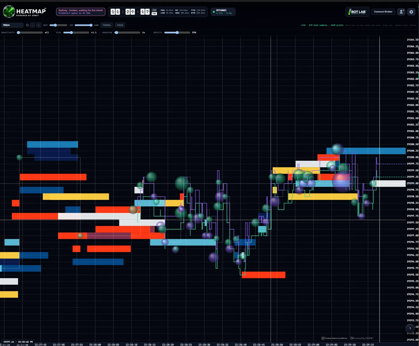
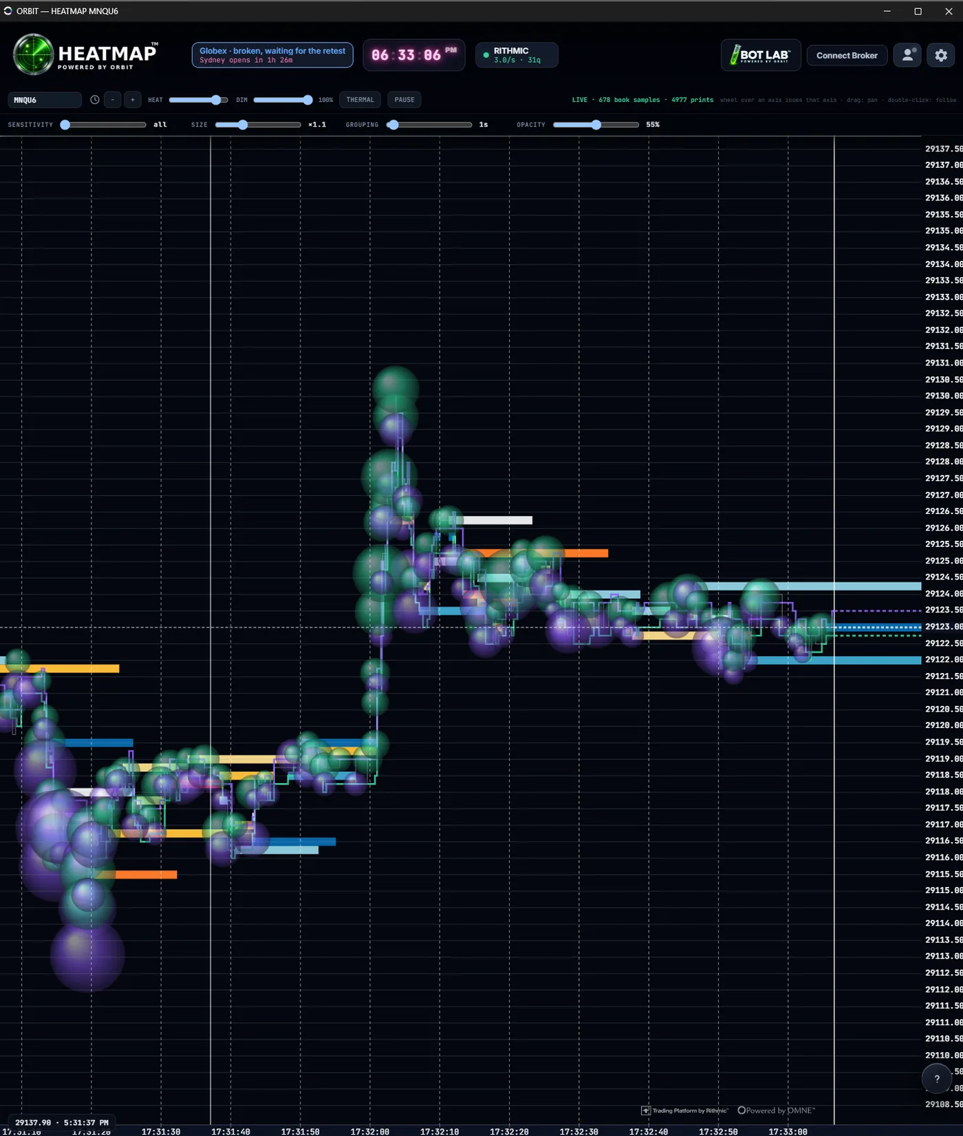
A candle tells you where price ended up. It does not tell you what was sitting in its way. The HEATMAP records the resting book as heat and paints the prints that went off as bubbles, so the liquidity a move had to consume is still on the screen after the move is over.
Each coloured band is size that rested at that price for as long as the band is wide. Each bubble is a trade that actually printed, sized by the trade. Where bubbles pile into a band, somebody spent real money getting through it — and that is a thing you can only see after the fact, which is exactly why it is worth keeping on screen.
- Six live controls. HEAT and DIM shape the liquidity; SENSITIVITY, SIZE, GROUPING and OPACITY shape the bubbles. THERMAL swaps the palette, PAUSE freezes the right edge so a burst can be studied while the market carries on without you.
- It records, it does not replay someone else's. The heat is built from the book as your own feed reported it, on your machine. No server of ours is in the path.
- Eyes only, by construction — there is no order path anywhere in this window. Not a hidden button, not a shortcut. The code to place an order does not exist here.
 CLICK TO ENLARGE
Liquid glass: an interface you can see through.
A trading screen has a problem no other software has. Everything on it is urgent, and all of it is competing for the same square inch — the tape underneath, the levels drawn on it, your position, your orders, the panel you just opened. Stack it in opaque boxes and you spend the session closing windows to see the chart you opened them to read.
So ORBIT's panels are made of glass. They float above the chart rather than replacing it. The market keeps moving underneath them, blurred and saturated so it reads as depth instead of noise. Nothing you need is ever fully hidden by something you opened.
Blur & saturation
What is behind the panel is smeared and its colour pushed, the way light pools inside real glass. It reads as distance, which is why your eye stops trying to focus on it and the panel becomes legible.
Refraction
A gradient tint running bright at the top-left corner and dark at the bottom-right — the direction a real lens would gather light. It gives a flat rectangle a shape.
The specular edge
A one-pixel bright line inside the top edge and a dark one inside the bottom. Almost the entire illusion lives in those two hairlines: they are what makes the surface look thick.
Depth
A long, soft shadow underneath. Not decoration — it is the cue that tells you the panel is above the chart and the chart is still there, which is the whole argument for the material.
Light that follows you
Surfaces catch a highlight where your cursor is, so the glass responds to the hand. Move over the screenshots on this page — the frames are doing it right now.
Colour with a job
Green is yours and working. Purple is the machine's. Red is a rail you are near. Amber is the clock. No colour is used decoratively anywhere in the app, so a colour appearing always means something.
 CLICK TO ENLARGE
And here it is doing the job.
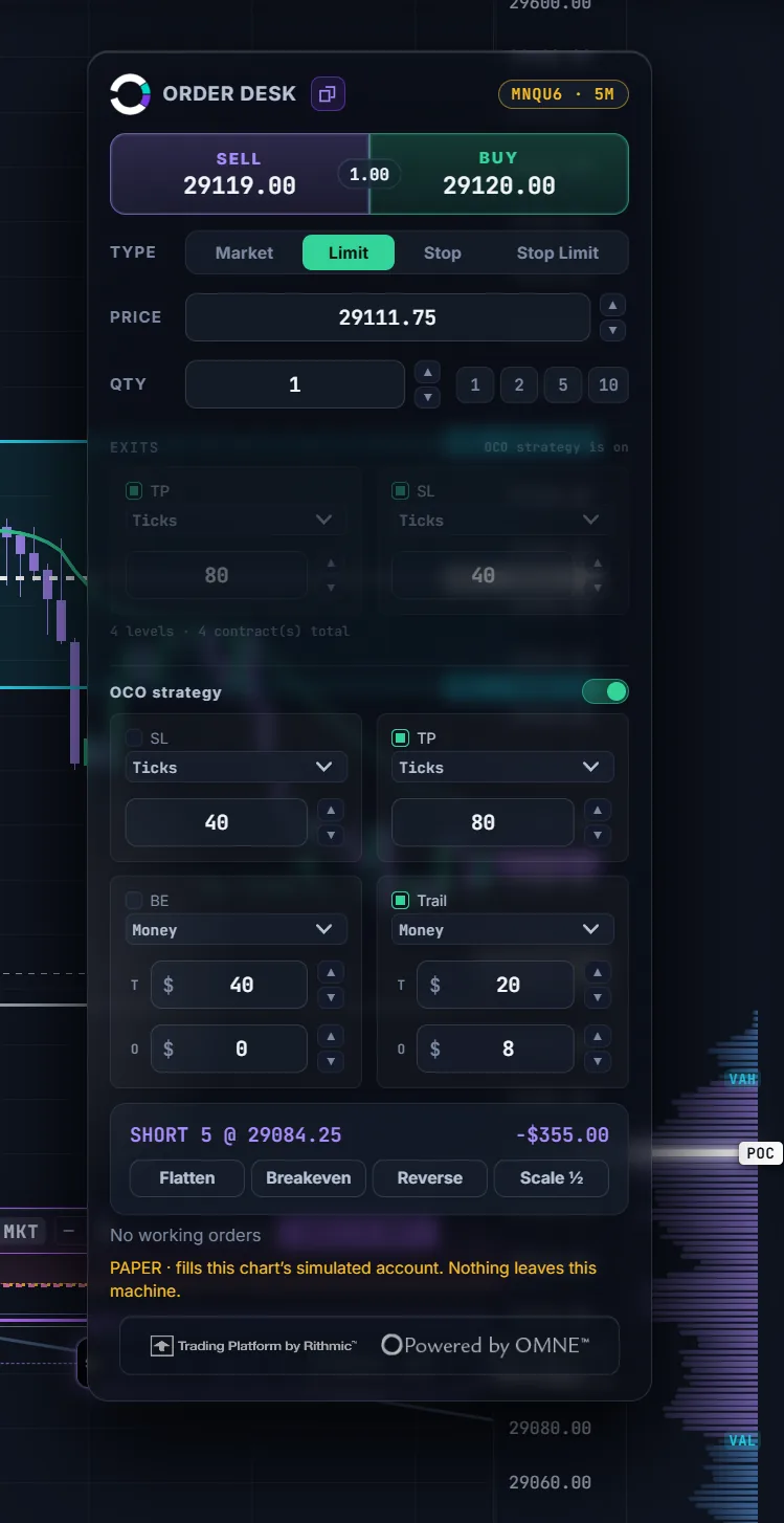
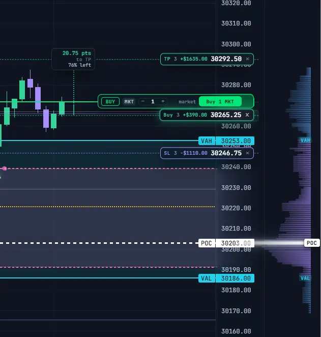
Not the demo — the actual ORDER DESK, open over a live chart. Every one of the four layers you just pulled apart is working at once: the tape behind it is blurred and pushed so it reads as distance, the tint runs bright at the top-left and dark at the bottom-right, the specular hairline sits inside the top edge, and the whole panel has thickness.
Look at what is still legible through it. The candles on the left, the volume profile down the right, the POC label, the value-area lines. You opened a full bracket builder on top of your chart and you can still see your chart — which is the entire argument for building the interface out of glass rather than boxes.
Nothing you need is ever fully hidden by something you opened.
 CLICK TO ENLARGE

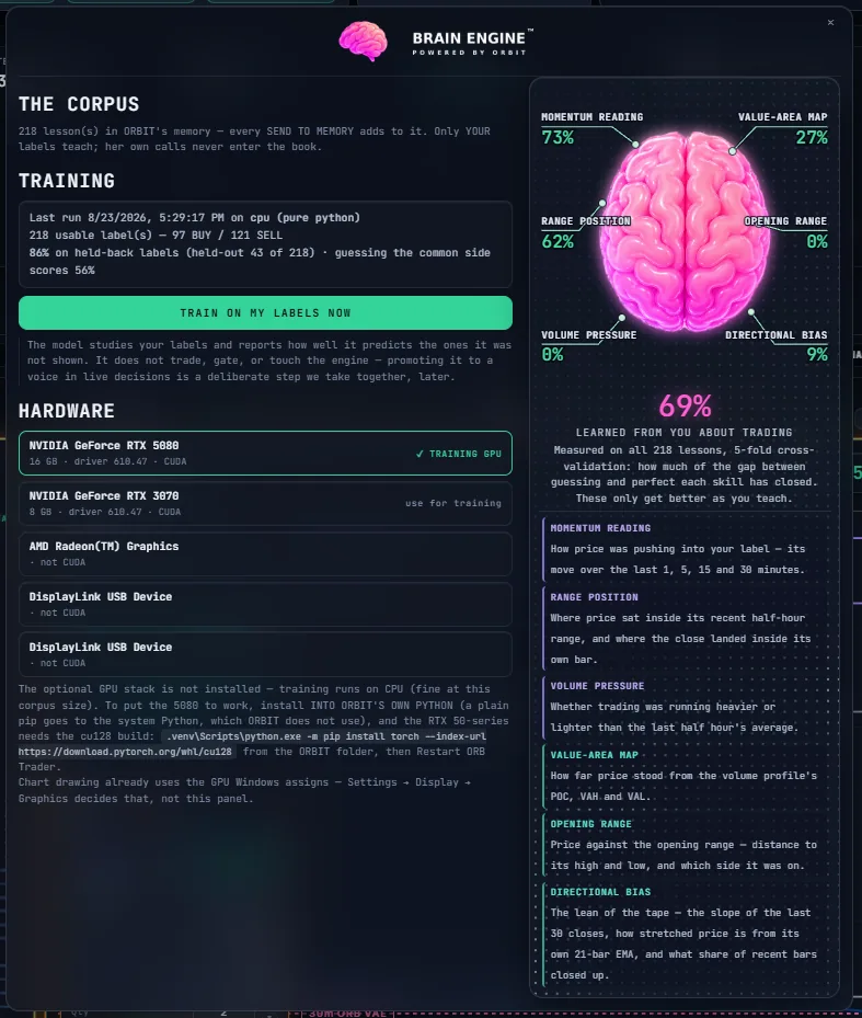
Train the model on your own GPU, from your own markers.
Your data. Your markers. Your machine. The Brain Engine trains locally — on your GPU if you have one — from the setups you labelled yourself. Not a model somebody else fitted to somebody else's trades, and nothing that has to leave your computer for any of it to work.
You teach it by marking charts. Every mark is stamped with the exact configuration underneath it, read fresh from the engine at the moment you send it. Then it studies the corpus and grades itself on labels it was never shown — against the score for simply guessing the commoner side, because that gap is the only number that means anything.
And then there is where this goes next. Eventually you will be able to opt in to a global community model — one that has seen how thousands of traders labelled the same failed retest, the same chop, the same opening range, and is better at recognising all three than any model taught by one person on one screen. Think of a fleet of cars making the next release of the driving software better than the last, applied to setups instead of roads.
- Only your labels enter the book. The platform's own calls live in a separate store and cannot be merged in. A corpus contaminated with the machine's own guesses teaches the machine to agree with itself.
- Six skills, scored separately — momentum, range position, volume pressure, value-area map, opening range and directional bias. A single accuracy number hides everything useful.
- It trains on your hardware, your GPU if you have one, and nothing leaves the machine.
- Two loops, deliberately separate. ORBIT LEARN already closes the loop on the bots — measuring them and rewriting their stop, target and cooldown inside hard bounds. The label-trained model here is the second loop, and it currently measures and reports rather than gating a signal. Promoting it to a voice in live decisions is a step taken on purpose, not something that happens to you one morning because a percentage got high enough.
- The community model will be opt in, and off until you say so. What a contributing trader shares is their own labels — never their market data, which is licensed to them by their own provider and is not ours to move. Never credentials, positions or account numbers. Anyone who never opts in loses nothing they have today: the local model still trains on their labels, on their machine, and still improves with every one they add.
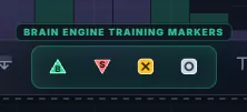
Drop a label. It gets a brain tick the moment it is saved. The corpus goes up by one — and the next time she trains, she trains on that too.
Drop a label, press SEND TO MEMORY, and the corpus goes up by one. The next time she trains, she trains on that too — which is the whole loop, in one gesture.
One connection, one brain, one journal. All four read the same feed and write to the same books, so the journal totals the lot and ORBIT answers from any of them with the same numbers. Switch windows and nothing reloads, nothing re-syncs, nothing disagrees — and you jump straight between them from the header of whichever one you are in.
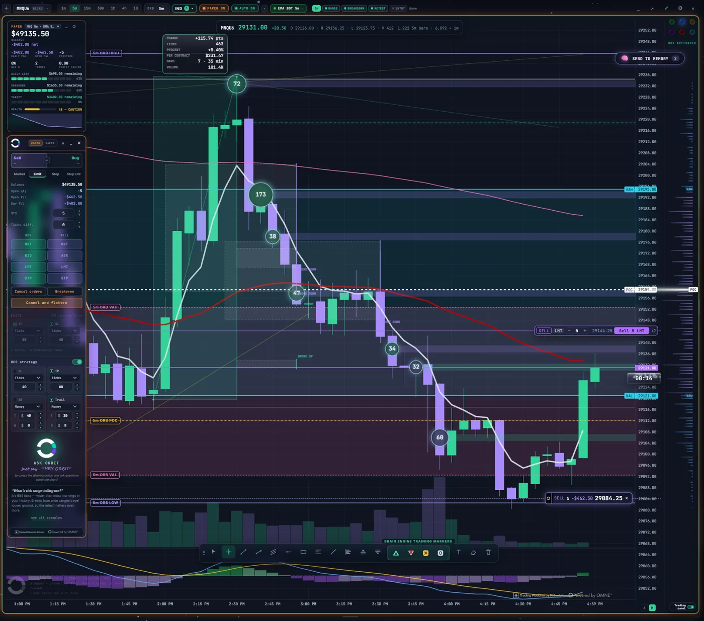
Screenshots are from paper accounts during development. They show what the software does, not what anyone earned.
Every window, and what it is actually telling you.
Screenshots on software sites tend to be decoration. These are not — each one below is a real screen from a real session, and the note beside it says what to look at and why it matters. Every figure is from a paper book during development.
CLICK TO ENLARGE
Nineteen strategies, same market, same second.
Every row is one experiment: an instrument, a timeframe, and one opening-range preset — CLASSIC, SCALER or RUNNER. Same setup, three different ways of managing the exit.
Read across a row and you get the whole story: the contract, the window, OPEN for what the position is doing right now, DAY for where the book stands, then the strategy and the account it answers to. Every row ends in PAPER.
MNQ 5m and NQ 5m are running the identical idea at different contract sizes. Stack them and the difference between the rows is the exit rule, not luck — which is the only way to find out whether the exit rule is doing anything.
CLICK TO ENLARGE
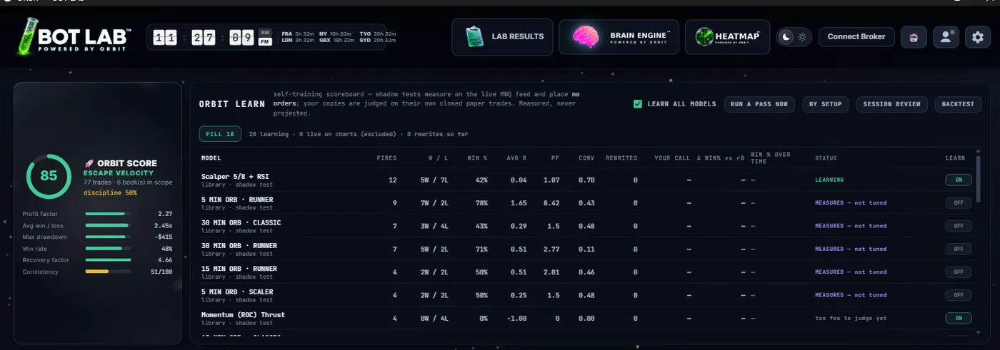
Every model in the library, scored on its own trades.
Every model in the library runs as a shadow copy against the live feed and places no orders at all. It is judged only on its own closed paper trades — so a strategy earns its row by trading it, never by being fitted to a chart that already happened.
Fires, wins and losses, win rate, average R, profit factor, conviction. And a STATUS column that is blunt: LEARNING, MEASURED — not tuned, or too few to judge yet.
The top row has a 42% win rate and the row under it has 78% — and neither is marked as good. Nothing here is promoted, ranked or recommended. It measures, and it stops.
 CLICK TO ENLARGE
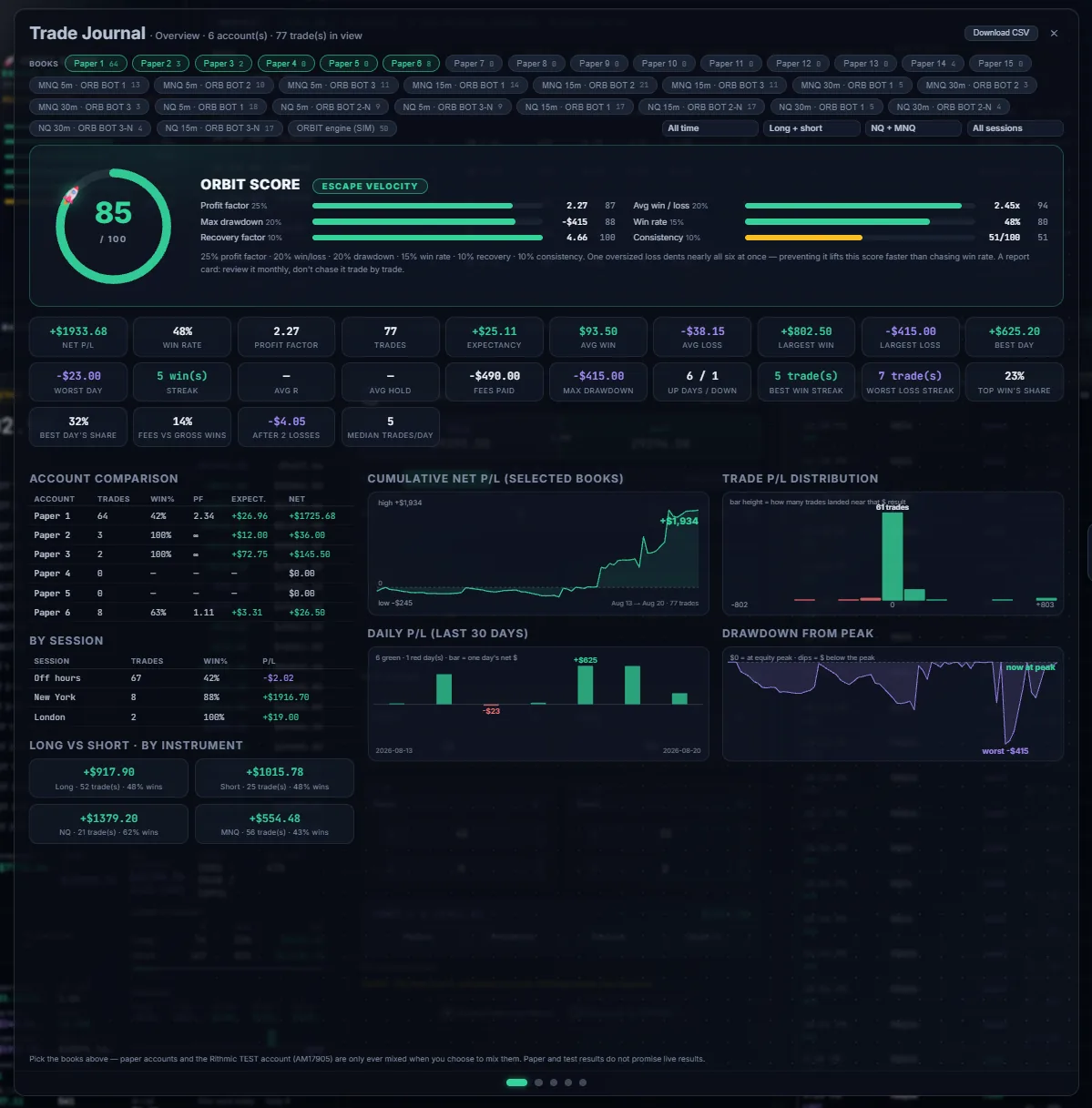
It grades the trader, not the account balance.
Six weighted components: profit factor 25%, average win/loss 20%, max drawdown 20%, win rate 15%, recovery factor 10%, consistency 10%. Win rate is deliberately fourth — chasing it is the classic way to wreck the other five.
Underneath: expectancy, fees against gross wins, what happens after two losses, best and worst streak, and the share of the whole book that came from its single best day.
The consistency bar is the amber one — the lowest of the six, on a book the other five are happy with. That is the panel doing its job: telling you the uncomfortable thing rather than the flattering one.
 CLICK TO ENLARGE
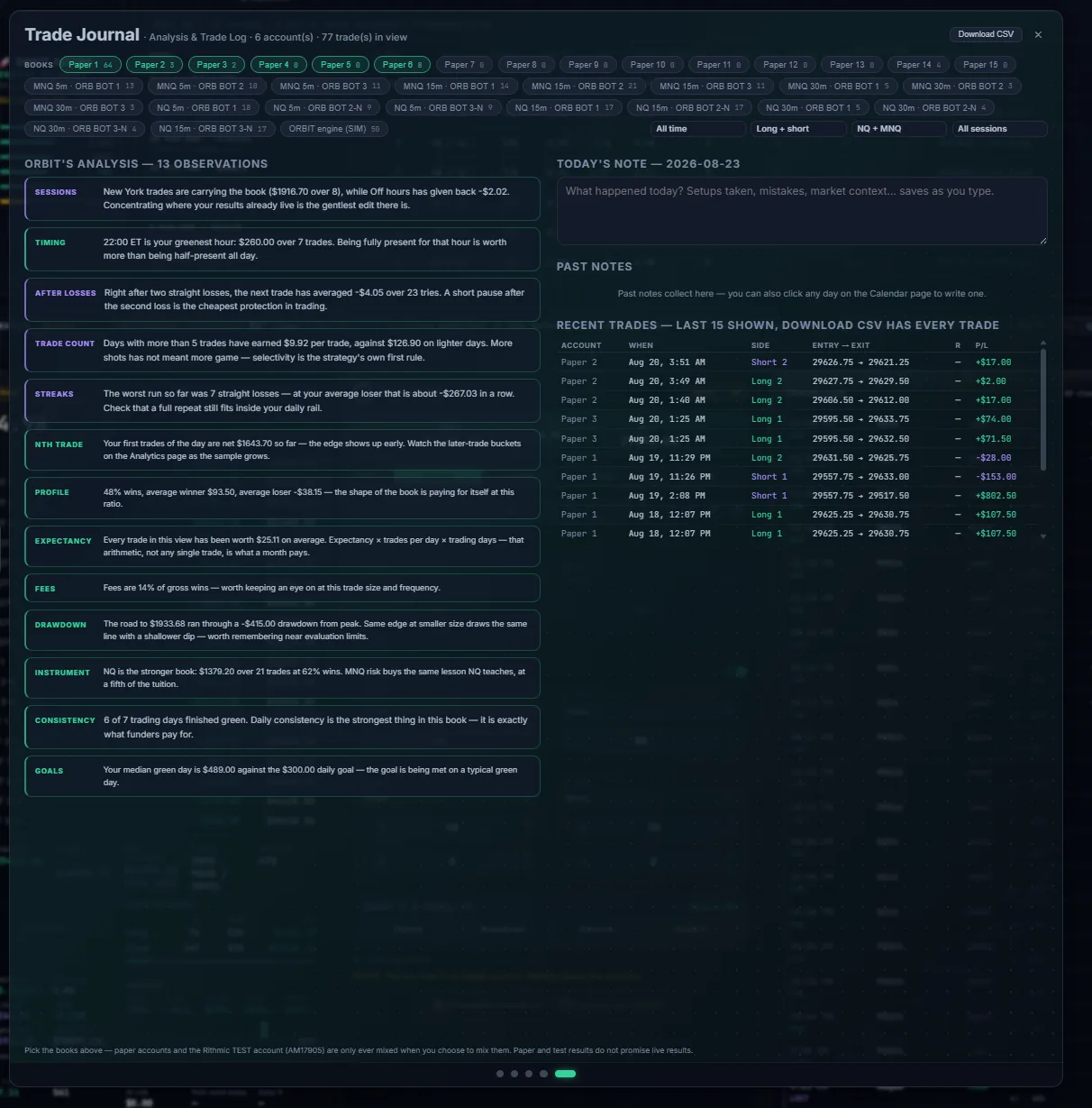
Statistics are useless until someone says what they mean.
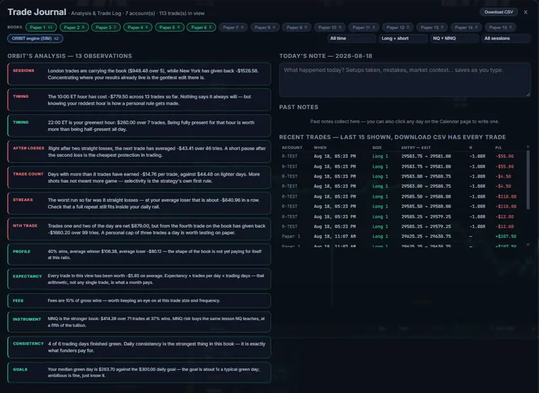
So ORBIT writes it out. Which session is carrying the book. Which hour is greenest. What the next trade has averaged right after two straight losses. Whether more trades has actually meant more money, or just more trades.
Each observation names the figure it came from, so you can check it instead of believing it — and each ends in something you could actually do differently tomorrow.
“Days with more than 5 trades have earned $9.92 per trade, against $126.90 on lighter days.” That is the sort of sentence a spreadsheet will never say to you, and it is the whole reason this panel exists.
 CLICK TO ENLARGE
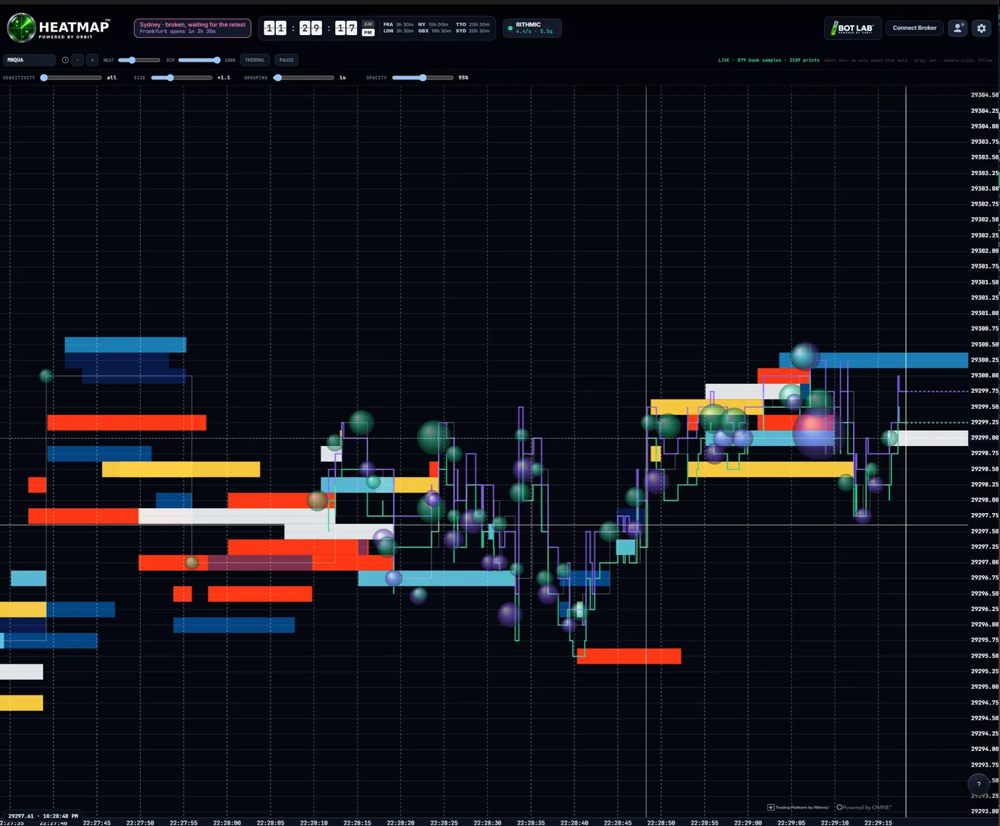
The orders that were in the way, kept on screen.
Each coloured band is size that was resting at that price for as long as the band is wide. Each bubble is a print that actually went off, sized by the trade. Where bubbles pile into a band, someone spent real money getting through it.
Six live controls: HEAT and DIM shape the liquidity, SENSITIVITY, SIZE, GROUPING and OPACITY shape the bubbles. THERMAL swaps the palette; PAUSE freezes the right edge so a burst can be studied while the market carries on without you.
Top right: LIVE · 879 book samples · 2109 prints. It says how much it has actually recorded, because a heatmap drawn from thin data should admit it rather than look confident.
CLICK TO ENLARGE
The prints worth turning your head for.
Every trade at or above your size threshold is drawn at the price it actually printed, carrying its contract count. Size and opacity both scale with it, and the colour says which side crossed the spread.
A 173-lot in the middle of a drift is a different market than a hundred ones adding up to the same volume, and a candle cannot tell you which one you just watched. This can.
These are published prints — things that already happened, not a prediction of the next thing. The whole order-flow deck in ORBIT is reactive by design. React, don't predict.
CLICK TO ENLARGE
218 lessons, six skills, and an honest score.
The corpus is your labels and only your labels — the platform's own calls live in a separate store and cannot be merged in. Training runs on your machine, on your GPU if you have one.
The number that matters is not the big one. It is 86% on held-back labels against 56% for guessing the commoner side: how well it predicts labels it was never shown, next to the score for not thinking at all. Six skills are graded separately, because a single accuracy figure hides everything useful.
Two skills read 0%. Nothing hides that. It means the next batch of labels is best spent there — and it is exactly the information a panel designed to impress you would have quietly rounded away.
 CLICK TO ENLARGE
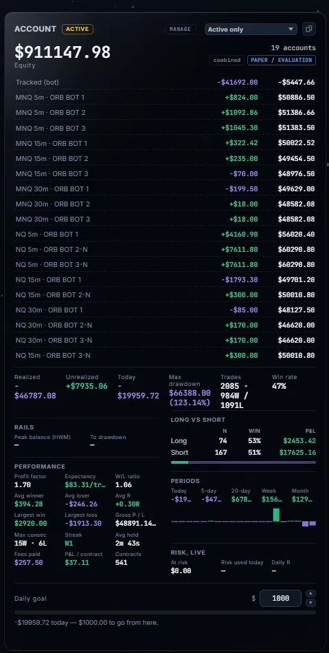
Nineteen accounts, counted once each.
Every strategy on the wall owns a separate book with its own balance, its own day and its own rails. The combined line at the top walks unique account ids, not rows — so two charts bound to the same book cannot silently double a total.
Underneath sit the things that decide whether you are still allowed to trade: peak balance, room to drawdown, risk used today, daily R, and the daily goal with the distance still to go.
PAPER / EVALUATION is stamped at the top, and every figure on this page carries the same stamp. A total that lies is worse than no total at all — and so is a simulated one that forgets to say so.
Every screen here is from paper accounts during development, captured 24 August 2026. They show what the software does, over a short window, on simulated books — not a track record, not live results, and not a promise of either.
This is the actual application.
Not a mockup, not a render — screenshots of ORBIT running on live markets. Pick a piece and look at it.
Paper and broker test accounts.
She wakes up.
No cuts, no mockups. This is the application running.
React. Don’t predict.
Candles tell you what price did. Order flow tells you who is in control — buyers or sellers — and how: passive size defending a level, or aggression pressing through it. ORBIT reads the live tape, every hit and every absorption, so your decisions answer the market actually in front of you, not a forecast.
This is what supercharges the opening range breakout. A break with aggressive buyers stacked behind it prints differently in the flow than one running on air — the difference between a break and a fake is written in the tape, for anyone equipped to read it. The data tells you more than you think.
Heavy aggressive buying or selling slams into a price — and price will not move. Large passive orders are soaking it up, often the signature of a defended level. The tell is in the dots: big prints stacking at one price while the closes go nowhere — effort with no result. ORBIT’s engine watches for it live in the depth and tape, so the level doing the absorbing has a name before price leaves it.
A move stretches to an extreme and the aggressive volume behind it dries up. The side that was pushing has run out — often the first quiet sign a move is done. Watch the dots shrink and fade as price pushes on: each new high made on less conviction than the last, until the final push prints almost nothing at all. The chart still looks strong — the tape already went quiet.
One side substantially more aggressive at a price is an imbalance. Imbalances stacked across several consecutive prices read as real momentum — conviction you can see, level by level. A single lopsided print can be noise; a ladder of them climbing through the bar is a crowd leaning the same way at any cost, and that is the kind of aggression that starts moves rather than chases them.
Price rises while selling dominates the tape — or falls while buying dominates. When price and aggression disagree, the move is on borrowed time, and the tape says so before the chart does. The bars under the candles are the delta — who was actually hitting the market. A green chart over a red delta is a move walking on air, and the tape tends to notice before the last buyer does.
Breakout chasers caught on the wrong side when price snaps back. Their forced exits become fuel — and a readable signature in the order flow. The buys that chased the high now sit above price, underwater; every one of them is a future seller, and when they give up together the snap-back accelerates. The tape shows the moment the trap springs.
Hidden size replenishing at one price. Auctions left unfinished at the exact high or low that price tends to revisit. High-volume nodes and the point of control acting as magnets. It is all in the flow — when your platform shows it. ORBIT’s roadmap brings these to the same charts you already trade from, labelled in plain language instead of jargon.
Founder seats start at $49.
Full price is $149/month. The first ten founders pay $49 — $100 off, every month, forever.
Or $500/year — annual takes a further 15% off, which is $41.67/month and $1,288 a year less than list.
The ladder climbs $10 every ten seats to fifty, then $20 every twenty to $149. It only ever climbs for the NEXT seat — never for one already taken.
Added to any futures subscription. Everything you already have, plus equities.
COMING AFTER LAUNCHEquities without futures, for traders who do not touch the contract market at all.
COMING AFTER LAUNCHWhat you get, and what you bring
- The ORBIT desktop application, running on your machine
- The ORB engine, the bot library, all 43 studies and the order-flow deck
- ORBIT herself — the voice copilot, and the Brain Engine that trains on your labels
- The journal, the ORBIT SCORE and the discipline tracker
- Paper accounts and fire drills — unlimited
- Updates while your subscription runs
- Your own broker account. We are not a broker and never hold your money
- Your own market-data feed and exchange entitlements. ORBIT does not resell data — CME fees are paid to your provider, not to us, and are typically a few dollars a month for non-professional use
- A Windows PC
Your credentials are entered on your machine and stay there. We do not operate a server that receives or relays your market data.
Usernames and checkout open with First Flight — the list below is the boarding order.
Diagrams are schematic illustrations of each behavior, not platform screenshots.
What the launch list sees first
ORBIT is being battle-tested on live markets every session. Here is what is already flying in private development, and what lands next.
Live CME futures on professional-grade data, the ORB engine with hard risk rails, a voice copilot that answers over the tape and calls your fills, ORBIT SCORE, journal, paper accounts and fire drills.
Mark the setups you believe in and send them into ORBIT’s training memory with full chart context — the labeled tape that future intelligence is trained on. Your read becomes the ground truth.
A guided connections screen for your own broker, execution and market-data credentials — no config files, and your keys never leave your machine.
Footprint charts, big-trade markers and liquidity heat maps — absorption, exhaustion, stacked imbalances, delta divergence and trapped traders, surfaced live and taught to ORBIT through your own labeled tape.
ORBIT already sees your chart and speaks to it. Next she gets hands: live annotations and a pointer — circling the level being defended, marking the range as it forms, drawing what she is describing while she says it.
Trade once, mirror everywhere: copy your fills across your own accounts — paper to funded, one funded account to the rest — from inside the platform, honoring every account’s own risk rails.
Accounts, monthly and annual plans, and invitations in small waves so every trader gets a real onboarding. The launch list is the queue — position in line is position in time.
Every platform you juggle, folded into one cockpit.
Charts. Order-flow context. Execution. Journaling. A copilot who talks — one unified place. ORBIT sees the chart in front of you and the tape behind it, in real time. And next, she won’t just tell you what’s forming — she’ll draw it on your chart and point.
The Opening Range Breakout is the plan. Live order flow is whether the market is honoring it. ORBIT was built to read both at once.
Built by a trader. Engineered like an instrument. In private development, battle-testing on live markets right now — broker and platform partnership inquiries welcome.
Everything else, in detail.
The cockpit, the copilot, execution, the panels, the bot library, the indicator and order-flow deck, and the trade journal. The Brain Engine, the Bot Lab, the Heatmap and the glass are above — they are not repeated here.
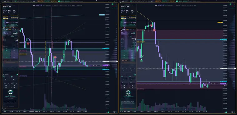
Up to eighteen live charts. Each one its own trading desk.
Most platforms give you one account and many windows. ORBIT inverts it: every chart carries its own account, its own risk rails and its own bot. Run the same strategy on three timeframes side by side, or three different opening-range windows against the same instrument, and watch which configuration is actually working — on the same screen, at the same time, on the same tape.
CLICK TO ENLARGE
Charts on one screen
Arranged in any layout you like, saved between sessions. Link charts with a click of an LED and they share a wallet, a symbol and settings; unlink and they go their own way.
Chart to account
Paper or live, chosen per chart. A chart armed on paper cannot reach your broker at all — not a dry run, not a demo endpoint. The block lives in the engine, not in a badge.
Opening-range windows
Sydney, Tokyo, Frankfurt, London, New York, Globex — each drawn on the chart as it forms, each with its own trade budget, each able to run a different configuration of the same bot.
 CLICK TO ENLARGE
 CLICK TO ENLARGE
Just say… “Hey ORBIT”
ORBIT is a voice-native assistant that can see your whole screen — not just the chart in front of you, but every window you have open, and the relationship between them. The levels, the profile, your position, your working orders, your risk budget. Ask her out loud and she answers out loud, so your eyes never leave the tape. She will place an order when you tell her to, call your fills, and tell you plainly when she does not know.
She also knows the books. Every account on the desk, what each one is carrying, and the P&L of the book behind whichever chart you are asking about — so “how is that one doing?” is a question with an actual answer rather than an invitation to go and look it up yourself.
She reads the chart, not a script
“The range formed at 20:05 and broke above 29529.25 at 22:49. You're now in the waiting phase — price is below the break point, and the retest window is open for another 55 minutes. That is the setup sequence working as designed.”
“Price is at 29522.75, inside the range. The visible profile shows the POC at 29523.00 — right where you are now. The strongest support line has six touches and runs down from 21:34 to 22:53.”
“You're flat and have 600 dollars of daily loss room left. The rules are waiting: if price retests the range low and holds, the retest confirms and I fire. If it breaks below the low before the retest window closes at 23:49, the setup dies for today.”
Her hands work.
This is no longer a thing she is going to be able to do. She reaches the chart. Ask her about a level and she draws on it — a glowing arrow whose point sits on the exact price she is naming, a dashed halo around the zone she is explaining, labelled in her own words.
And her reach is not one pane wide. With the vision system integrated she can point across windows — at the chart, at the panel beside it, at the heatmap on the other monitor — and walk through how the things on your screen relate to each other, marking each one as she goes.
It is the difference between an assistant that describes your screen and one that is in it. Say “clear your marks” and they all go.
Pointing and drawing work today. Highlighting controls and driving menus are in active testing and are not finished — they are on the roadmap, not in your hands yet.
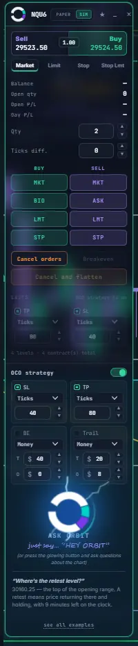
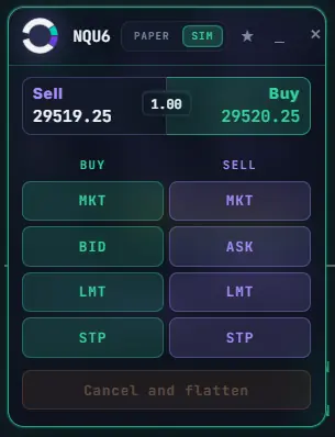
The whole order ticket, docked to the chart it belongs to.
Market, bid, ask, limit and stop — buy and sell, one click each, always in the same place. Underneath: a full bracket builder with take profit, stop loss, breakeven and trailing, in ticks or in dollars, with multi-level scale-outs. Set it once and every entry inherits it.
 ENLARGE
 ENLARGE
 ENLARGE
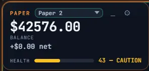
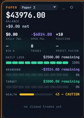
Every panel collapses to exactly as much as you need.
Screen space is the scarcest thing a trader has. So nothing in ORBIT is one fixed size: each panel folds down to a headline, opens to the numbers that matter, or opens all the way — and remembers which you chose, per chart.
 CLICK TO ENLARGE
Macro Market Watch — and yes, there is a light theme.
A strip across the top of the cockpit showing the names that move index futures — NVDA, AAPL, MSFT, GOOGL, AMZN, AVGO, META, MU — each with last, high, low, VWAP distance, previous close and volume. When five or more sit on one side of VWAP, it says so, because that is when the break behind you has something behind it.

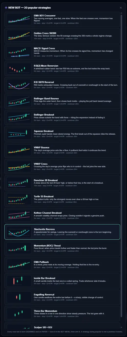
Twenty strategies, ready to arm. Every one born disarmed.
The opening range is the house strategy, but it is not the only one in the building. Pick a classic from the library — crossovers, mean reversion, volatility breakouts, VWAP, channels, momentum — and each arrives with a plain-English explanation, a suggested timeframe, an ATR-based stop and target, and a cooldown.
 CLICK TO ENLARGE
Illustrated, explained, and honest about itself
Each entry draws its own idea — you can see what a squeeze breakout or an engulfing reversal actually looks like before you pick it. The description says what the strategy believes, in one sentence, without jargon.
Then, at the bottom of the panel, the line that matters:
That sentence is printed inside the product, where a customer sees it every time. It is the same standard the rest of the platform is held to.
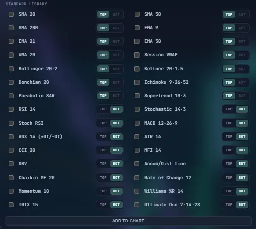
The standard library, plus what the tape is actually doing.
Thirty-two classical studies, each placeable on the price panel or in its own pane with a single toggle. And underneath them, a second deck that most retail platforms do not have at all: reaction-based order flow, read from the published prints.
 CLICK TO ENLARGE
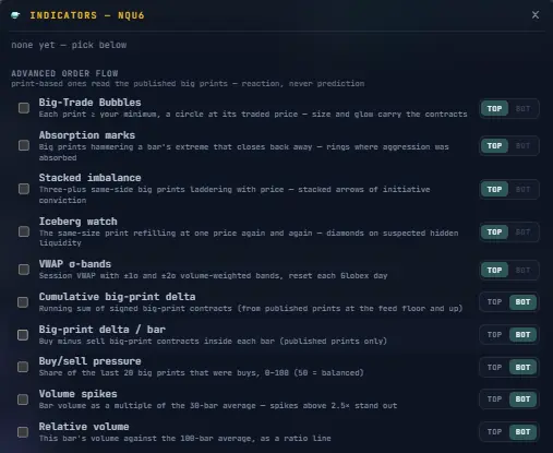 CLICK TO ENLARGE
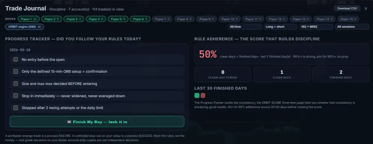
Five pages that grade the trader, not just the account.
Every fill lands in a journal that separates your accounts, computes the statistics that actually predict survival, and then does the part nobody else does: tells you what it found, in sentences.
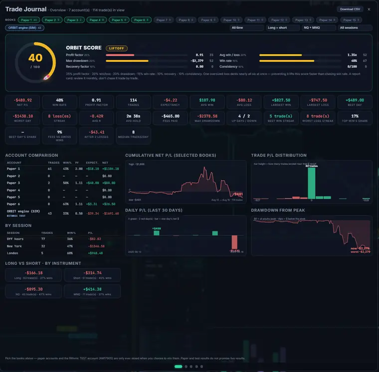 CLICK TO ENLARGE
The ORBIT SCORE, and the distance between two of them
One number, out of 100, built from six weighted components — each shown with its weight so you can see exactly why the number is what it is. The ranks climb from LIFTOFF to ESCAPE VELOCITY. Below are two real score cards from the same trader's own books, days apart. This is the point of the whole journal.
 CLICK TO ENLARGE
 CLICK TO ENLARGE
How the score is designed to be improved
The weights are published on the card because a score you cannot reverse-engineer is a score you cannot act on. Read left to right, they tell you what to fix first — and the cheapest fixes are almost never “win more often.”
And the discipline page carries the other half of the answer: rule adherence is tracked separately from money, because a green day on a broken process is not progress. The app's own guidance is to aim for 90% adherence across 30 to 50 days before chasing the score — get the process clean, and the score follows it. Not the other way around.
 CLICK TO ENLARGE
It says the uncomfortable part
“Right after two straight losses, the next trade has averaged −$43.41 over 46 tries. A short pause after the second loss is the cheapest protection in trading.”
“Days with more than 8 trades have earned −$14.76 per trade, against +$44.48 on lighter days. More shots has not meant more game — selectivity is the strategy's own first rule.”
“The 10:00 ET hour has cost −$779.50 across 13 trades so far. Nothing says it always will — but knowing your reddest hour is how a personal rule gets made.”
Each observation names its own sample size, because an observation drawn from four trades is a rumour.
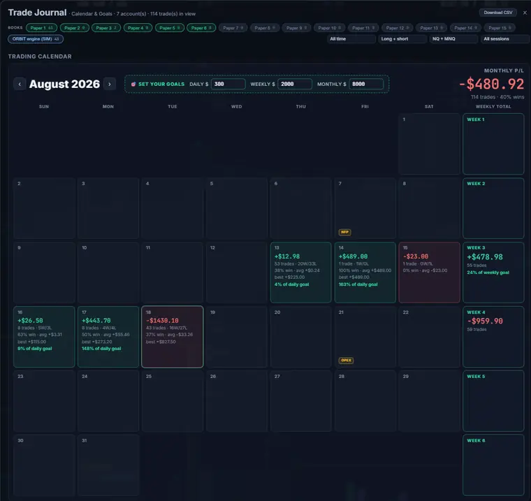 CLICK TO ENLARGE
 CLICK TO ENLARGE
Every figure on this page comes from paper and broker test accounts — they show what the journal measures, not what anyone earned.
Still scrolling? That usually means yes.
One email. First access, founder pricing, launch news only — and a say in what gets built next.